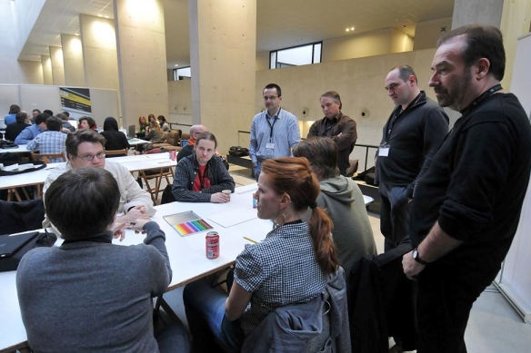
Following the successful launch of National Geographic on the iPad (which won the National Magazine Award for best tablet magazine in 2012), last October we started the iPhone edition of the magazine. Available by subscription (which includes access to the iPhone, iPad and Kindle Fire versions), the iPhone edition posed a significant design challenge for our design team. According to Bill Marr, our Creative Director:
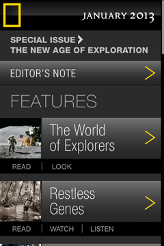
“You’d think that the size is the first hurdle. What we found was that the real challenge was organizing content. We had to re-think what we were doing on the iPad for this smaller format. We wanted it to be much easier to navigate and organize things simply—the table of contents is basically the guidepost to the whole app.”
The app features daily content, such as photos from readers, news and the daily Instagram feeds of our photographers as they work on the field.
Perhaps the biggest challenge was to adapt our content rich information graphics, maps and illustrations for the tiny screen. How did we go about it?
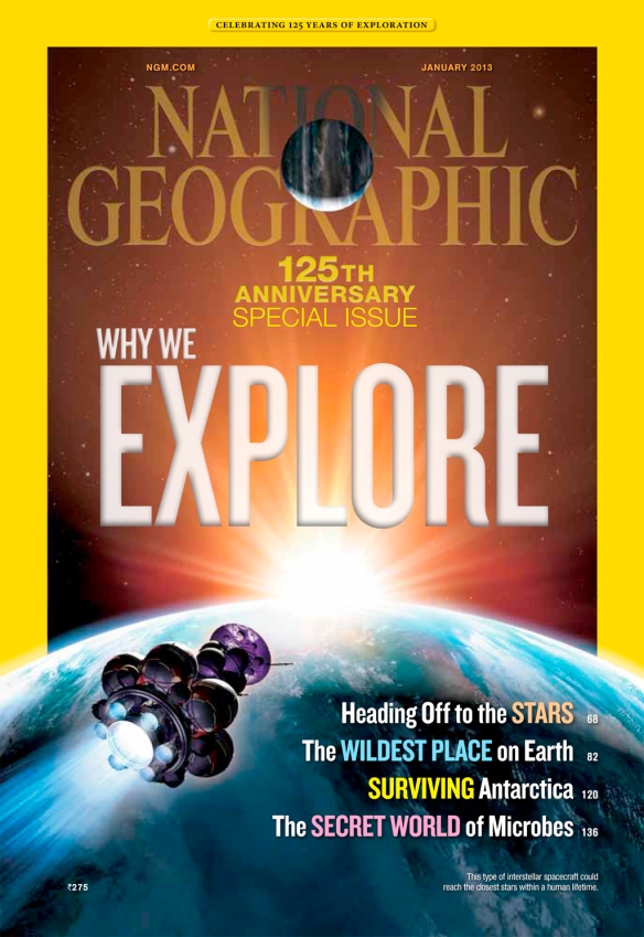
Although illustrations are easier to adapt than data rich graphics/charts and maps, which need to be broken down into small pieces, the small format doesn’t always make justice to the power and beauty of art pieces. On the flip side, we are now able to animate art. Our iPhone covers always have motion. As an example here is our January 2013 cover for print, followed by the animation we created for the iPhone. The great illustration by space artist Dana Berry comes alive, free of all the type we obviously need to run on the print edition. Click on any examples of the print graphics throughout the post to see large versions more similar to actual print size:
Here is the video:
The layout of the iPhone edition is clean and simple. All stories have been reorganized and broken down into three or four parts: Read (the text), Look (a gallery with the story photographs), Watch (videos, including graphics) and Listen (voice-narrated article). Bill Marr and Lisa Lytton, our Director of Digital Editions, worked with Joe Zeff Design studio to create a series of templates using Adobe Digital Publishing Suite (a set of tools that adds interactivity to layouts directly within Adobe InDesign).
The table of contents:
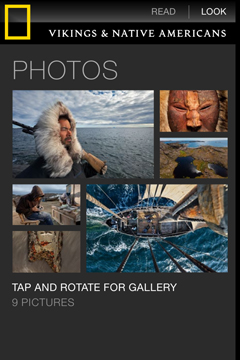
Photos look stunning on the iPad screen, and I think they look really nice on the iPhone too despite the tiny size.
The Listen menu takes us to a new feature where the user can choose to listen to the author reading the story. With more and more people getting their news on the go during their commutes, I think it will be a popular feature.

Many of the animated graphics are created in-house using After Effects, the Adobe motion graphics software that could be described as a timeline-based Photoshop. If you have used some Flash you’ll get comfortable using After Effect relatively quickly (and you won’t need Action Script).
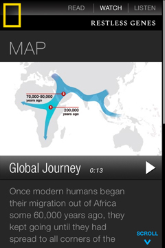
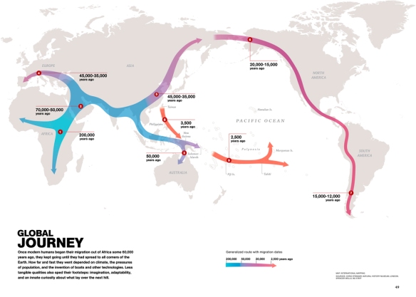
The short video below added a new dimension to a map we created for the January issue to show the path and timing of human migration as we occupied the Earth’s land after coming out of Africa about 60,000 years ago. The speed of the arrow gives us a much better idea of the relative speed with which we moved into different continents. The expansion across the Americas was much faster than earlier phases of our collective journey.
This is the launching page:
Here is the video:
The print version. Writing the dates on the map is not quite as effective.
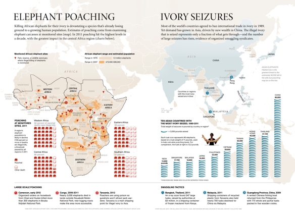
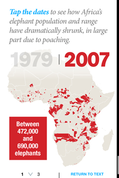
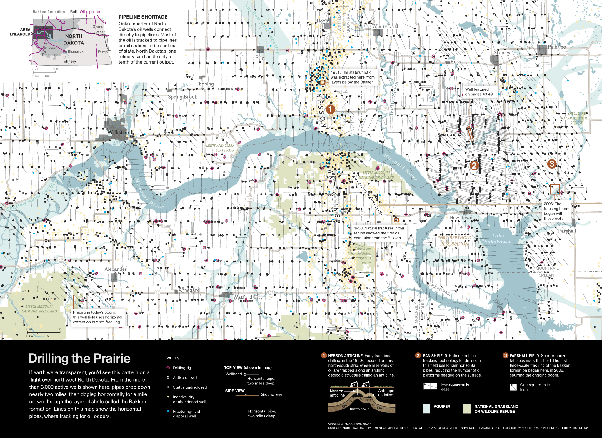
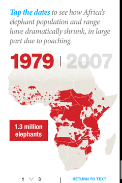
The toughest challenge by far is to adapt data intensive maps and graphics that were conceived as a unit editorially and visually. A good example is this October 2012 graphic showing the prevalence of elephant poaching in Africa as well as the Asian countries involved in the illegal international trade of Ivory, fueled by China’s new wealth.
It was clear that some of the content would need to be dropped to create a meaningful experience true to the nature of the device and the readership. The bandwidth limitations also requires more limited content.
We worked with Joe Zeff Design to design this simplified experience. In this case we chose to keep only the mapping of the decreasing elephant range in Africa (frist row below) the impact of poaching in different regions (second row) and a simple chart showing seizures of illegal ivory in five Asian countries.


Another example of complete simplification. Maggie Smith’s beautiful map of the Mesoamerican Reef, published in October, had rich bathymetry (underwater relief features), and showed critical habitats in this fragile ecosystem: mangroves, sea grass, coral reefs, marine protected areas and fish spawning sites.

On the iPhone, we went with a minimalist locator (on the iPad, however, we preserved all the content and layered it to allow the reader to see different habitats individually).
Alex Tait from International Mapping has been helping us to adapt many of our maps for the iPhone screen. I was the most expedient solution but eventually we plan on going with a tiling map approach (where you would be able to zoom in on a map to reveal more detailed content, as you would do on Google Maps). People certainly expect that on their phones.

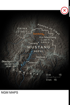
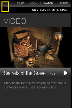
Illustrated information graphics posed the same problem. Fernando Baptista (graphic) and Martin Gamache (map) had created a beautiful piece about the Mustang caves of Nepal for our November issue (see Fernando’s amazing manual process to construct the cave here in an earlier entry of this blog). Here it is:
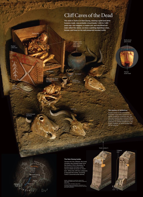
The finished graphic
It was just not possible to reproduce the rich visual experience of the print artwork on an 4-inch screen. Everything was eliminated except for the locator map. They are always a necessity in our stories, which often cover remote areas of the world.
But we did produce a video to be used on the iPad and iPhone.
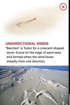
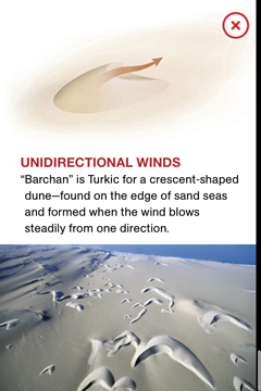
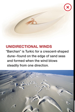
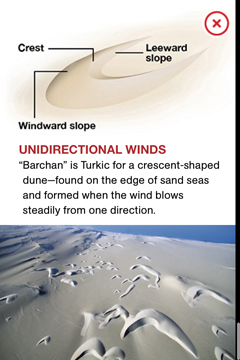
Motion is definitely a big advantage for simple diagrams that depict process happening in time. Graphics Editor Lawson Parker created and animated this nifty piece on the formation of dunes using After Effects. In print we had to run a sequence of small images.

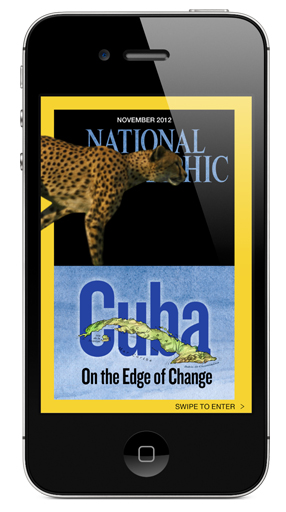
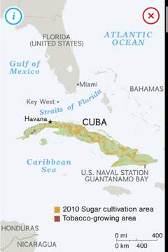
Martin Gamache’s beautiful map of Cuba in the November issue was also simplified to the minimum expression.
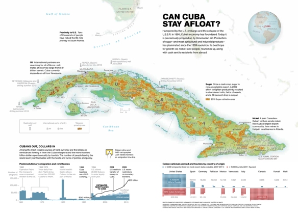
The iPhone map:
Large graphics can be shown as a whole on the iPad allowing readers to pinch and zoom through the static print version, but the experience is painful on the small screen and is not ideal for the iPad either as it doesn’t take advantage of the possibilities of the new medium to layer a break down complex content.
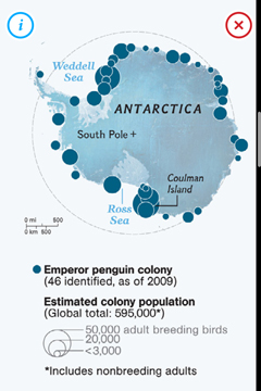
Last month I featured Fernando Baptista’s graphic on diving penguins:
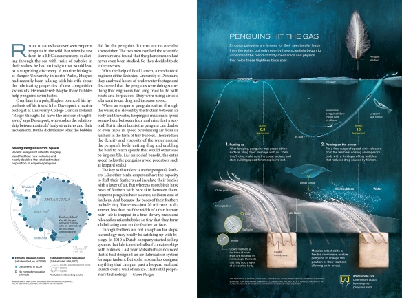
The map, created by Maggie Smith, worked perfectly on the iPhone screen, and we run a teaser pointing readers to Fernando’s terrific interactive version for the tablet edition. While technically possible on the iPhone, the experience would be too complex on the iPhone to be enjoyable :
Here is what we did on the iPad:
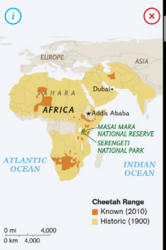
Our Cheetahs November story was converted into a simple map of the cheetah range (known and historic) and a DPS interactive that allowed the reader to learn more about amazing anatomical adaptations of the fastest-running animal on Earth. But it was impossible to convey the amazing infographic created by Senior Graphics Editor Jason Treat and artist Bryan Christie.

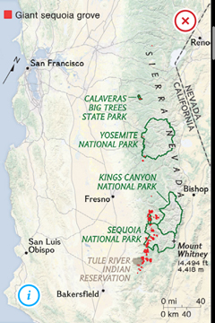
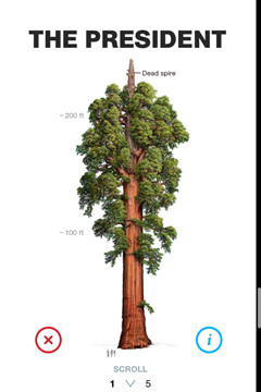
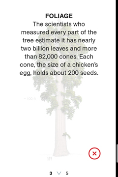
Senior Graphics Editor Martin Gamache created a stunning spread on sequoias, the giant and magnificent trees growing on the western slope of the Sierra Nevada. The art was created by Bob Van Pelt.
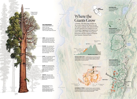
On the iPhone, we opted for a simplified map and a sequence of illustrations explaining the different parts of the tree.

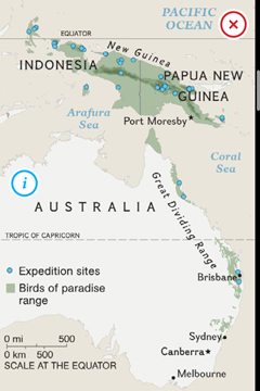
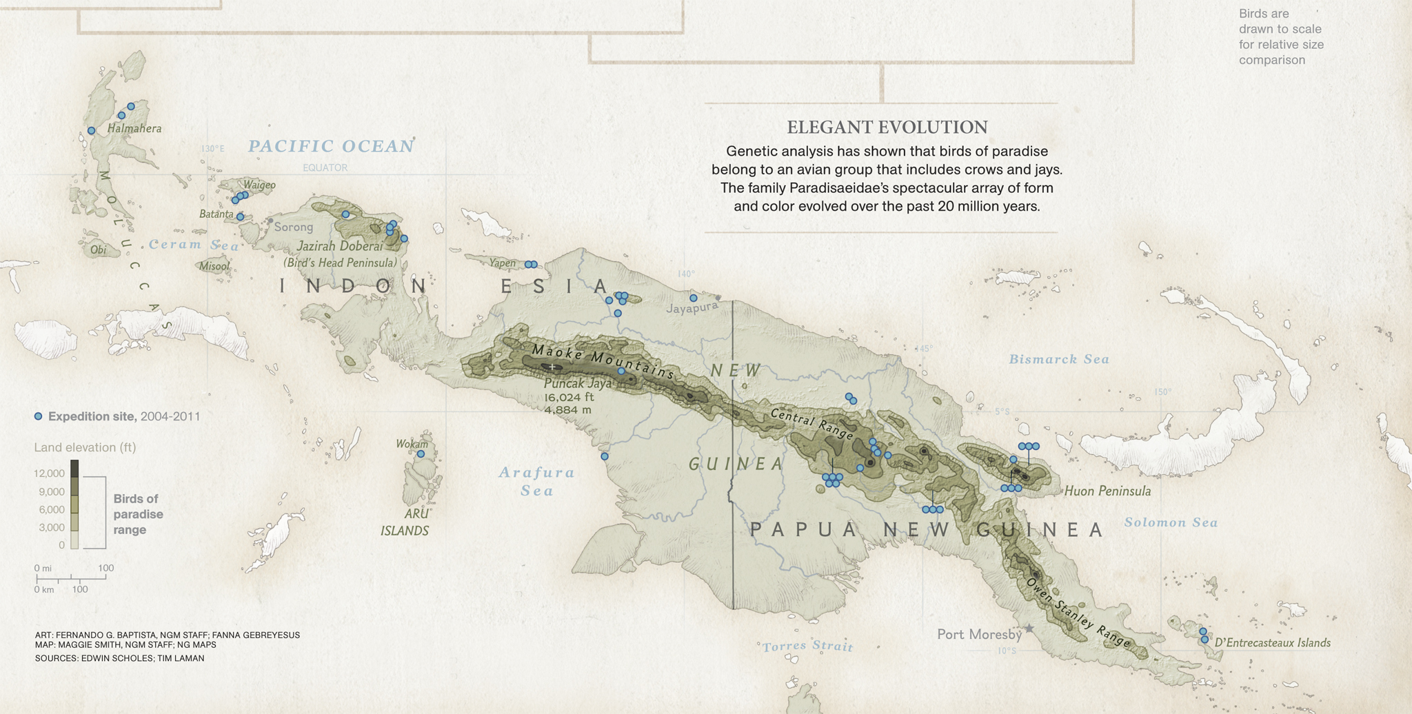
Fernando Baptista and Maggie Smith’s gatefold on the Birds of Paradise of Australia and New Guinea …
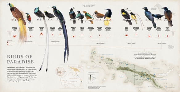
… and the iPad version.
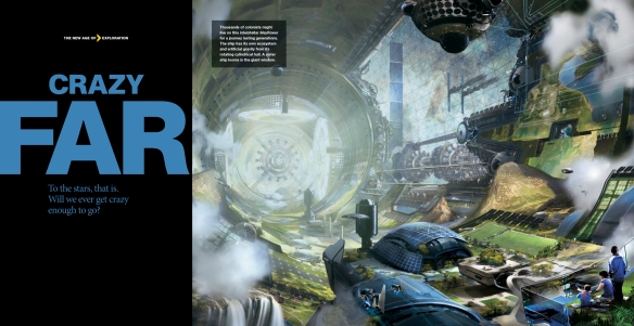
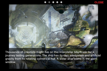
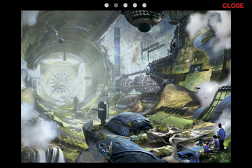
Art doesn’t present the problem of dealing with complex layers of information, and we judge each piece individually to see if it will read well on the phone screen. Stephan Martiniere’s illustrations on the possibilities of reaching stars outside of our Solar System, published on our January 2013 issue, gave important information and striking visuals to a story with very few photographs, so they were deemed essential. They show well on the small screen. Tapping on the images reveals the caption.
Print:

iPhone:
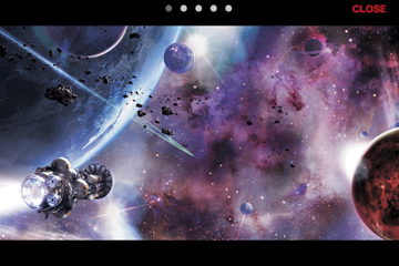
Print (this was the opener for the story):
iPhone:

Finally, another example of interactivity using Adobe’s DPS. Lawson Parker’s graphic in the January 2013 issue looks at the thousand of bacteria species that inhabit the human body (outnumbering human cells by 10 to 1). Did you know there are 2,000 distinct types of bacteria behind your ears, and they are for the most part different species in each ear?
Lawson quantified the bacteria with a grid of dots following their location in the body:
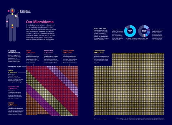
The dots would not work on the tiny screen. A very simple presentation gives the reader the chance to click on different body locations to see how many kinds of bacteria we host in each of them. Minimalist and effective.


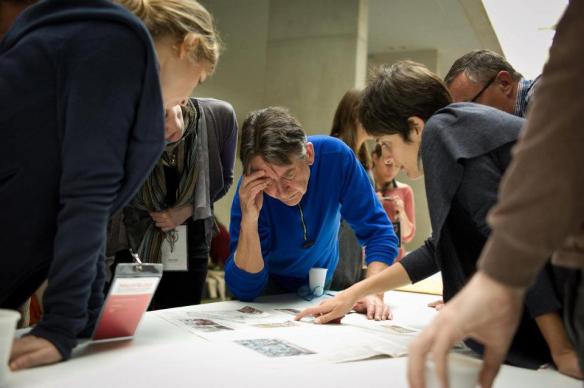
All the December and January graphics were adapted in-house by Lisa Lytton’s talented team (Kevin DiCesare, Susan Lee, and Stewart Bean).
We spend months researching for information graphics, art and maps and it’s always a bit painful to eliminate really interesting content, but the reader collecting our print edition has completely different habits compared to the (probably younger) reader who is looking for information on the go. Nearly everyone carries a smartphone on the pocket or purse. We obviously plan to be on the Android platform as well. Adapting our rich content for an evolving readership it’s a really fascinating challenge as we enter our 125th anniversary year.


($1bil weather)")


($1bil weather) copy")


 NATIONAL INFOGRAPHIC